For My Lunch
User Experience Design / Wireframes / User Interface Design / Design Systems / Responsive Design / Merchandise Design
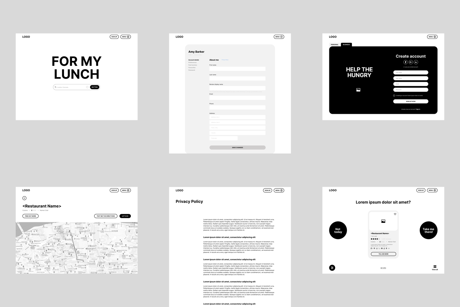
User experience and interface design for a software called For My Lunch (FML). Aiming to help hungry and overwhelmed workers with the daily dilemma of what to have for lunch. This project was developed with the team at Klutch Studio, learn more about the team and their work at klutch.studio
Problem
Hungry young professionals in London are facing a common dilemma: they're overwhelmed by the abundance of lunch options available to them but they don't have a lot of time to decide what to eat. In addition, many users struggle to differentiate between outlets that offer genuine quality and those that are all hype with no actual flavour, adding to their uncertainty when it comes to making a lunchtime decision. They need help making a good, confident, and delicious choice that will keep them fuelled for the rest of their busy day.
Brief
The goal is to create a user-friendly digital product that provides personalised food outlet options to help busy professionals make quick and confident decisions on what to eat for lunch.
Inspiration & approach
Our inspiration for this project was rooted in the brand personality of the everyday man archetype - we aim to create a product that felt helpful, honest, dependable, and friendly, while also incorporating a sense of joyfulness about lunch.
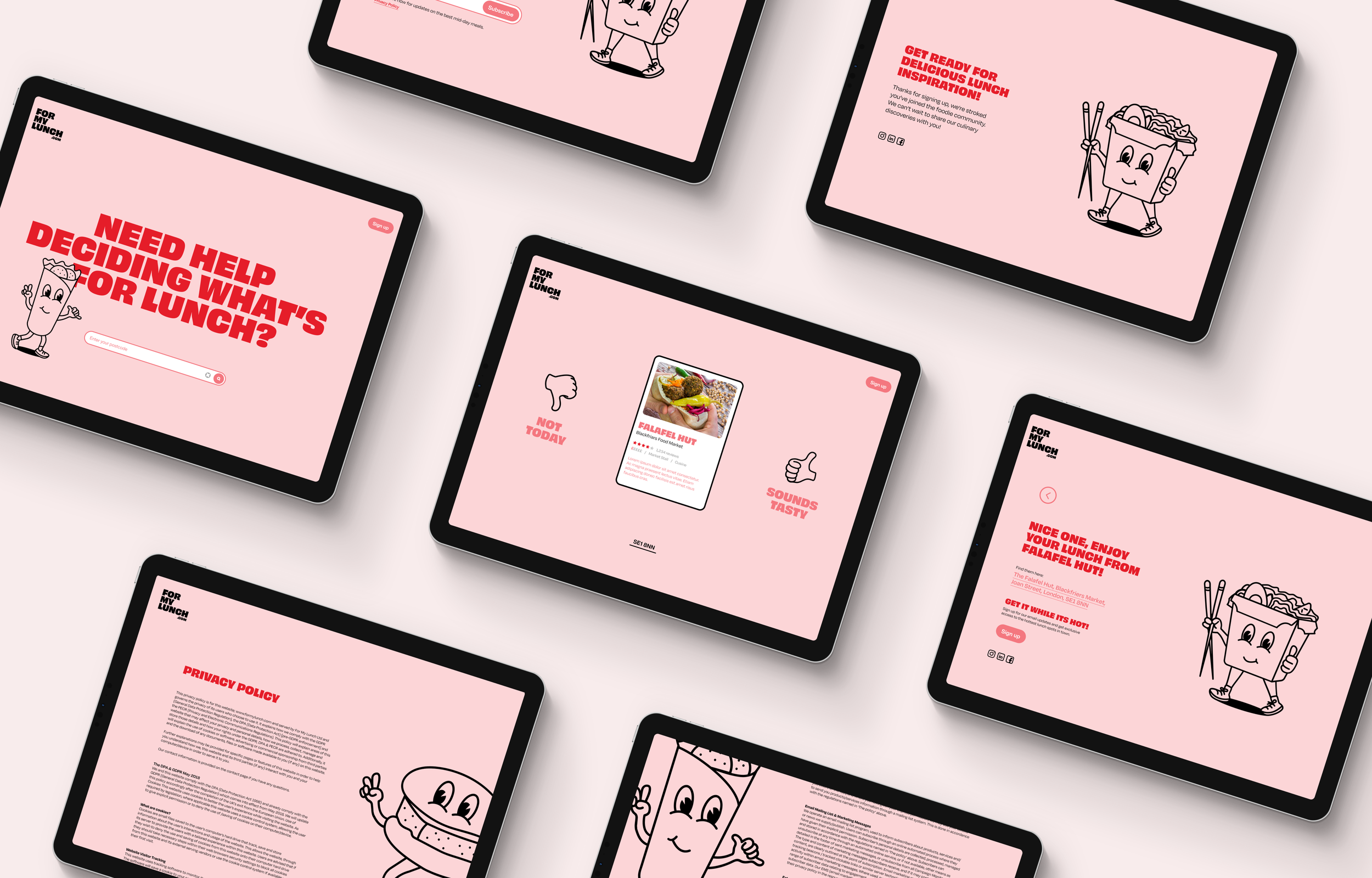
As we sought to inject a sense of joy and playfulness into the brand; we incorporated happy foodie characters. We opted for an imperfect, hand-drawn style for these characters. This imperfection gave them a human quality, despite being food characters, which added to the brands genuine and honest feel. This same influence helped us determine our primary typeface which was imperfectly curvy and bold inducing further feelings of being fun and authenticity.
The food influence also inspired us to experiment with colours, ultimately leading us to choose berry red and smoothy pink as our primary colours. These hues captured the vibrancy and energy of the food world, aligning with the brand's friendly and approachable personality.
When it came to writing copy, we focused on keeping things casual and relatable to our audience, leaning into the "everyday man" archetype. It was important to us that our language felt genuine and non-hyped, in line with the overall tone of the brand.
Taking inspiration from dating apps, we designed the UX and UI elements of our digital product to help users find their perfect match for lunch. We created a swiping mechanism that allows users to quickly swipe through different options based on their preferences for price, dietary needs, time constraints, and location. This mechanism is driven by an algorithm that helps to narrow down the options and provide a more personalised experience. Additionally, we incorporated a review system to help address any uncertainties users may have about the quality of different food outlets.
Outcome
After reflecting on the project, I believe that we successfully achieved the brand's goal of embodying the everyday man personality and incorporating a joyful vibe around lunch. Additionally, the digital product effectively addressed the decision paralysis and uncertainty faced by young professionals in London.
However, I recognise that the product is still in its early stages and could benefit from further testing and development. With additional improvements, it has the potential to become a valuable tool for both hungry customers and the featured outlets. One potential avenue we could explore is integrating it with social media platforms, which could increase the visibility of not only the reviews but also the brand and product as a whole. This could create a sense of community around the product, something to consider for future versions of the digital product.


