FatFace Autumn Campaign 2019
Retail Communication / Point of Sale Design / Email Marketing / Social Media & Influencer Marketing / Direct Mail Design
The FatFace Autumn Campaign 2019 aimed to help our consumers with styling their wardrobes, whilst highlight our new cord collection which was crafted in our sustainable and ethically source cotton.
Direct Mail
My priority for this season was overseeing the direct mail including the catalogue. As per the new visual guide lines, the pages were kept stripped back, clean and simple, allowing the product to take centre stage. We printed this on a textured, sustainably sourced stock, this gives a premium feel to the catalogue and is in-keeping with the companies values around sustainability.
Photographic Considerations
Using full bleed images allowed each collection or story to be introduced with impact. Continuing through, I used a mix of large and multiple, smaller image compositions to create a good pace. Key products brought in large units highlighted in large spaces, the compositions of smaller images used to inspire ways of wearing and accessorising these. Sprinkled through were atmospheric images to carry through the story of each collection.
Typographic Considerations
Typography was used appropriately as per the visual branding guidelines. I took an opportunity to push this using the headers to mimic the story teamed with each collection. For example the transitional, sustainable print collection, was entitled “Stepping Lightly into Autumn” I typeset the characters as per the guidelines but staggered them across the opening spread for this story as if the words them selves were stepping forward into the composition. This was fun and visually drew peoples eyes across the page and further into the catalogue.
Angie Smith
This season saw our first collaboration with Angie Smith a stylist influencer who curated a capsule wardrobe aimed to appeal to our newest target market who are younger and more trend focused than some of other consumers. I delighted to be given the opportunity to work directly with the communications manager to conceptualise, develop and finalise the visual handwriting for this collaboration. Lots of the lines where completely sold through, see the catalogue feature for this capsule below.
Digital
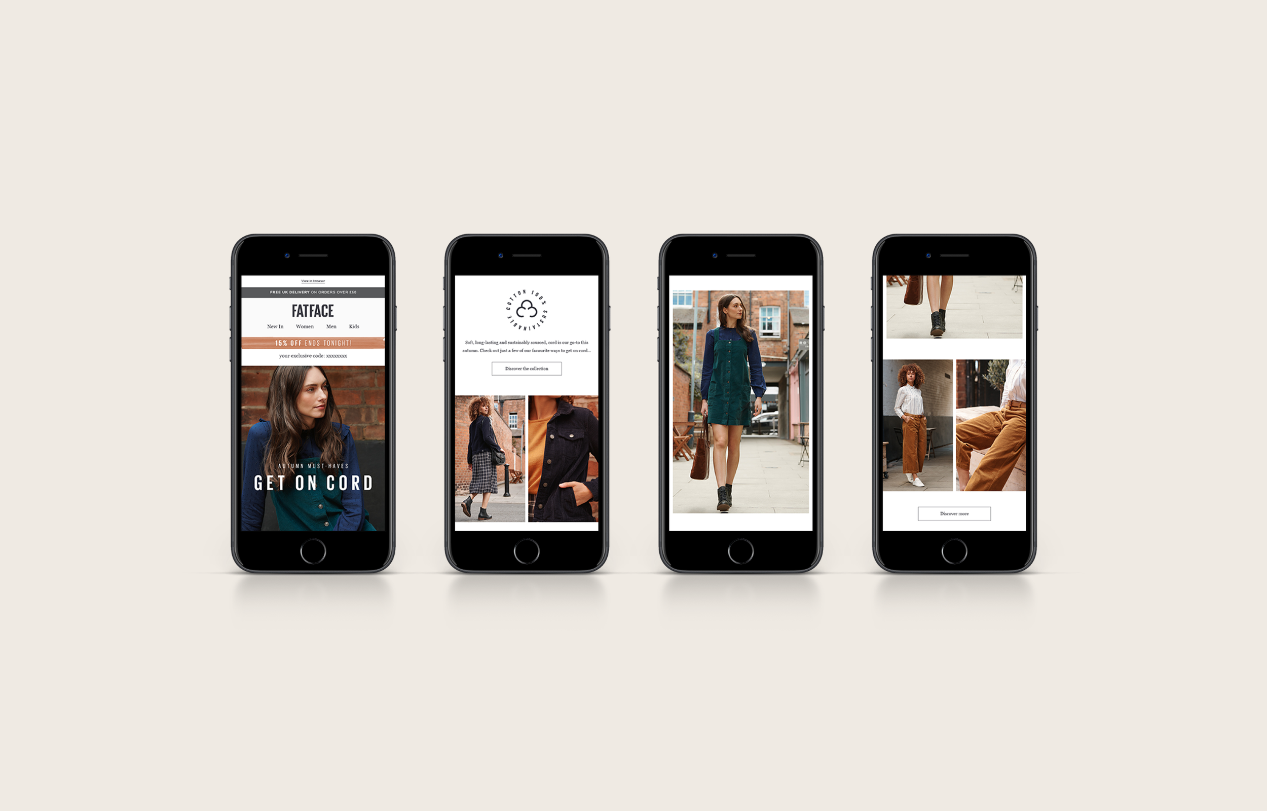
Outside of direct mail I helped design digital assets for the email campaign, our website landing pages, blog post and social media content. The key to omni-channel approach is consistency, using the window and direct mail design as inspiration I applied the visual handwriting across these channels.
I worked closely with the digital communication manager and the e-commerce team I ensured my designs were executed to specification i.e. HTML and CSS friendly whilst being responsive enough to be viewed across varied devices. I ensured all elements created were on brand, user intuitive, easy to navigate, and ultimately would drive conversions.


